Chicago SQL Association – Now With A New Logo!
A while back I wrote about starting a not-for-profit, detailing the genesis of the Chicago SQL Association. This organization allows us to better manage the finances of our user groups and our SQL Saturday event. That post has proven quite popular, so I can only assume it has been helpful to others looking to set up their own legal entities. With that in mind, I would like to share our recent experience of getting a new logo designed.
Why
Our original (and now former) logo was designed by…me. Over a period of about two hours. I am not a graphic designer or an artist by any stretch of the imagination. I can't even make stick figures look good! So while this logo was decent and had a lot of nice Chicago symbolism including the oft-hidden-in-plain-sight municipal device, it was always in the back of my mind, and those of our board, that we would like to have something a little better-looking to represent our organization.
Seeking Professional Assistance
Much like when we started our organization, we decided to seek assistance from professionals early on. We had a variety of choices, such as retaining a design firm or hiring an artist directly. In the end, what we (and our budget) were most comfortable with, was 99Designs. If you aren't familiar with 99Designs, they are a website that connects organizations with artists either by pairing them up directly, or by allowing organizations to sponsor a design contest.
We went the contest route, which involves choosing a time limit that the contest will run for and specifying an award that the winning artist will receive. There is a questionnaire where organizations can explain their mission, values, and any specific imagery or colors that should be incorporated into the design. Over the course of our 7-day contest we received over 50 designs! Paring all these submissions down to a few finalists was some serious hard work.
Things to Consider
There are of course many things that should be considered when choosing a logo to represent the organization. The biggest ones on our list were:
- Symbolism – representing our mission of education and our location
- Uniqueness – we don't want to be too similar to other organizations
- Simplicity – too much detail and it may become difficult or expensive to embroider or otherwise print on swag
- Color – fewer colors are better, or if the design has many colors, a simpler variant should still look good
Several of the submissions we received used a mortarboard, and while that is a great symbol for education, it is also used in the logo for GroupBy, which we didn't want to infringe upon. We also had some designs that looked great on a screen, but were so complex that embroidery or screen printing would be difficult.
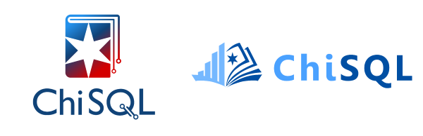
We Picked Two
In the end, we narrowed it down to our two top choices, and couldn't decide any further, so we ended up choosing both of them. Here they are!
All in all I would say we had a fantastic experience with 99Designs and the designers we worked with. I would highly recommend that website to any organization in need of design services.
So look for these logos on swag in the near future, especially at our upcoming SQL Saturday!